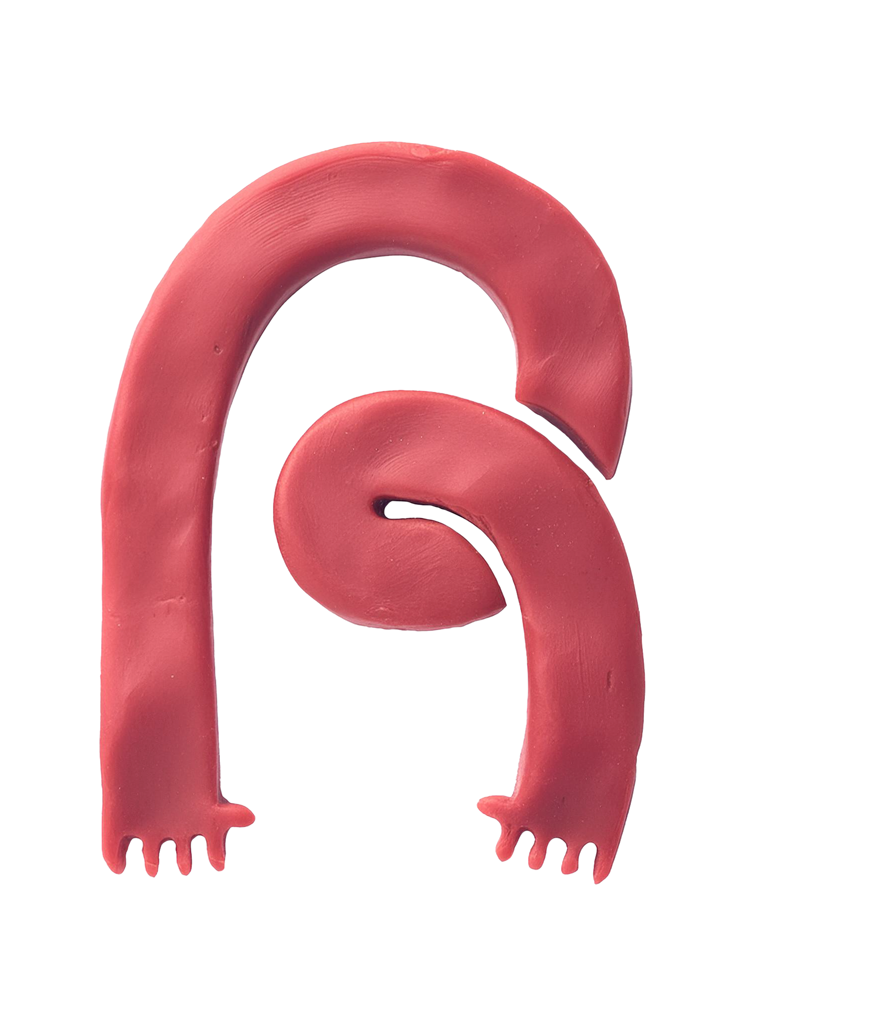

1.Nome e conceito
O nome JOMIS é uma homenagem ao filho do Tiago, o João Miguel.
Quando Tiago me procurou para desenvolver a identidade visual da pizzaria, ele já carregava há bastante tempo uma ideia muito clara do que queria: resgatar a estética clássica das pizzarias nova-iorquinas, com toda a sua personalidade e tipografia marcante.
Entre as referências que ele trazia, havia também o desejo de criar um símbolo humanizado, que pudesse representar a marca de uma maneira mais próxima e divertida.
A partir dessas ideias, o projeto começou a tomar forma, buscando equilibrar essa inspiração clássica com uma identidade própria para o JOMIS.
01. The name and the concept
The name JOMIS is a tribute to Tiago’s son, João Miguel.
When Tiago approached me to develop the pizzeria’s visual identity, he already had a very clear idea of what he wanted: to bring back the classic aesthetic of New York pizzerias, with all their personality, bold typography and that almost cinematic visual universe.
Among his references was also the desire to create a humanized symbol that could represent the brand in a way that felt more personal, playful and memorable.
From there, the project began to take shape, balancing these classic references with a visual identity of its own.


2.Construindo o símbolo
O símbolo nasceu de uma fotografia do Jomi ainda criança. A ideia foi transformar alguns de seus traços mais marcantes em uma ilustração simples e expressiva.
A partir da fotografia, fui simplificando as formas até chegar a um desenho de poucos elementos e linhas marcantes, mantendo a espontaneidade e a personalidade da referência original.
2. Building the symbol
The symbol was born from a photograph of Jomi as a child. The idea was to transform some of his most distinctive features into a simple, expressive illustration that would be easy to recognize.
His hair, face shape, eyes and especially his smile were reinterpreted in a graphic way, creating a character that feels personal and affectionate, while also working as the face of the brand.
Starting from the photograph, we simplified the forms until we arrived at a drawing made of just a few elements and bold lines, while preserving the spontaneity and personality of the original reference.

3.JOMI feito à mão
Uma parte especial do projeto foi pensar que, se a identidade teria a cara do Jomi, seria legal que ela também tivesse um pouco da sua própria expressão.
Por isso, alguns elementos da marca foram produzidos pelo próprio Jomi. A palavra PIZZA, assim como os nomes dos sabores do cardápio, foram escritos por ele à mão, do jeito que uma criança escreveria.
O Tiago me enviou as fotos dos desenhos, que foram escaneadas e posteriormente vetorizadas para que pudessem fazer parte da identidade.
O resultado mantém os pequenos desvios e a espontaneidade do desenho original. São detalhes que ajudam a deixar a marca mais pessoal e fazem com que o Jomi esteja presente não apenas como inspiração, mas também como parte da construção da própria identidade.
3. Jomi’s handwriting
One of the most interesting parts of the project was the idea that, if the identity was going to have Jomi’s face, it should also carry a bit of his own expression.
So, some of the brand elements were created by Jomi himself. The word PIZZA, as well as the names of the menu items, were handwritten by him, exactly as a child would write them.
Tiago sent me photos of the drawings, which I scanned and later vectorized so they could become part of the visual identity.
The result preserves the little imperfections, quirks and spontaneity of the original handwriting. These details make the brand feel more personal and allow Jomi to be present not only as the inspiration behind the identity, but also as part of its creation.


4.Cardápio
O cardápio segue a estética das pizzarias clássicas e de rua, trazendo uma linguagem gráfica simples e objetiva.
Para reforçar esse universo, aplicamos a escrita manual do Jomi em parte das informações, especialmente nos nomes dos sabores. A tipografia desenhada por ele convive com a tipografia principal da identidade, criando um contraste entre o que é mais estruturado e o que é espontâneo.
Assim, até um elemento funcional como o cardápio ganha um pouco da personalidade do Jomi e ajuda a construir a atmosfera da marca.
4. The menu
The menu follows the aesthetic of classic, street-style pizzerias, bringing a graphic language that is simple, direct and full of personality.
To reinforce this universe, we incorporated Jomi’s handwriting into part of the information, especially the names of the pizza flavors. His hand-drawn lettering lives alongside the identity’s main typography, creating a contrast between what is more structured and what is spontaneous.
This way, even a functional element like the menu becomes an extension of Jomi’s personality and helps build the atmosphere of the brand.


5.Ilustrações
Para ampliar a linguagem visual da marca, convidei a Luísa para participar do projeto e desenvolver algumas ilustrações que ajudassem a dar ainda mais personalidade ao universo do JOMIS.
Passei um briefing com algumas ideias e caminhos que imaginava para as ilustrações, e ela não só entregou o que havíamos planejado, como também trouxe novas ideias e soluções que enriqueceram muito o projeto.
O resultado é uma coleção de desenhos que pode aparecer de diferentes maneiras pela identidade, criando pequenas surpresas e reforçando o lado divertido, espontâneo e autêntico da marca.
05. Illustrations
To expand the brand’s visual language, I invited Luiza to join the project and develop a series of illustrations that could bring even more personality to the JOMIS universe.
I shared a brief with some of the ideas and directions I had in mind for the illustrations. She not only delivered what we had planned, but also brought new ideas and solutions that made the project even richer.
The result is a collection of drawings that can appear in different ways throughout the identity, creating little surprises and reinforcing the brand’s playful, spontaneous and authentic personality.


Cartela de adesivos e pin com o símbolo da marca.
Sticker sheet and pin featuring the brand’s symbol.


Lacre da pizza com o formato do "Little Jomi".
Pizza seal featuring the Little Jomi shape.

Versão do cardápio mais enxuto.
Compact version of the menu.
